Pale Blue Dot
typography // print // publication
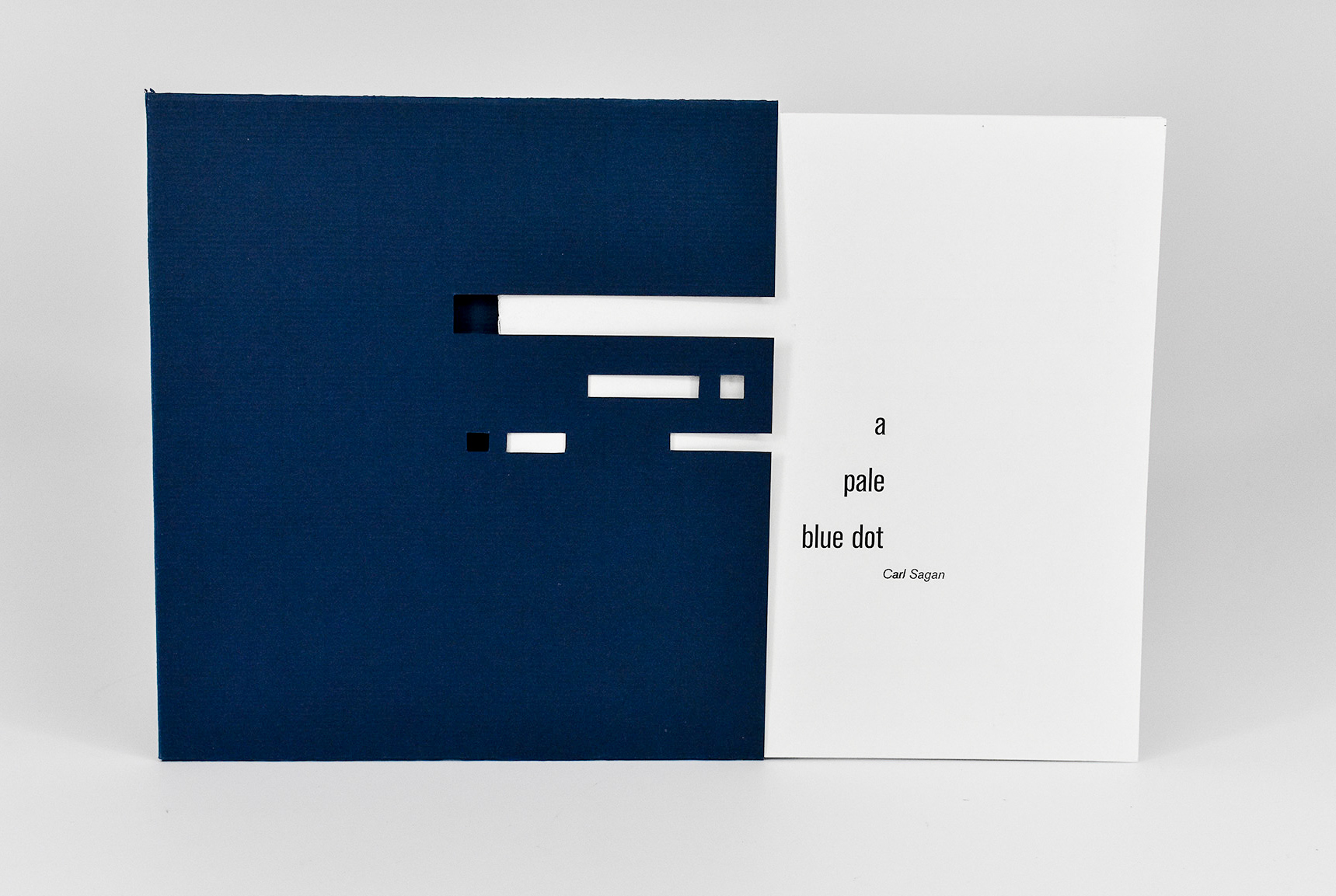
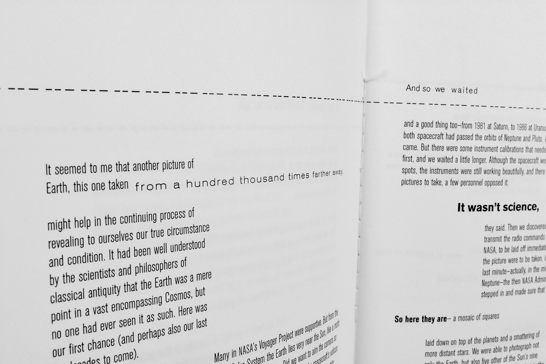
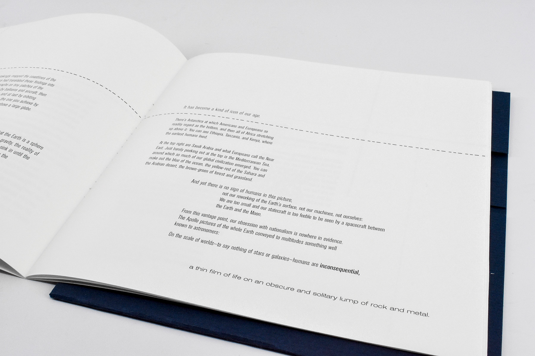
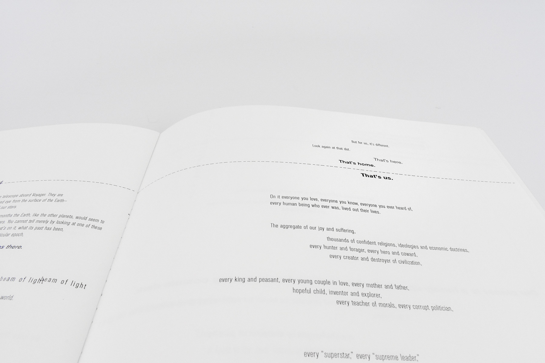
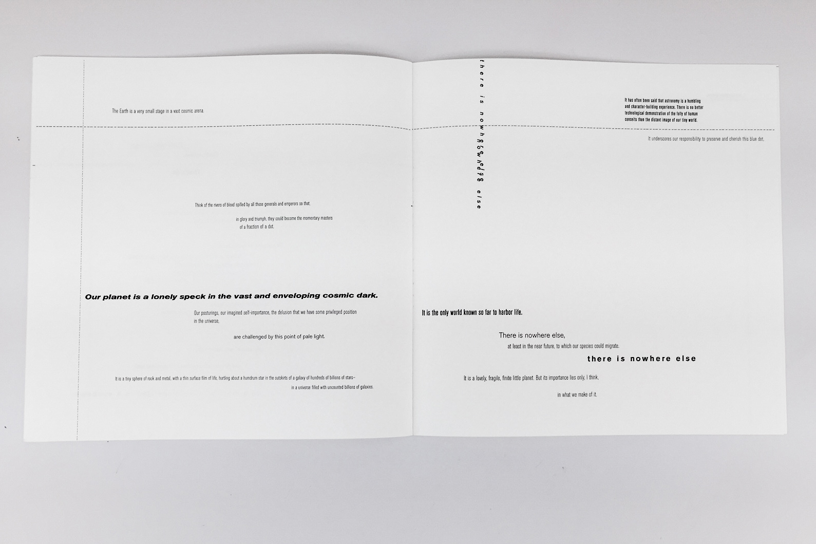
For an undergraduate typography class I designed the typography for the first chapter of Carl Sagan’s book “Pale Blue Dot.”
In this chapter he discusses Voyager I’s photo taken of Earth in 1990, which depicted Earth from the farthest away it had ever been seen, the technicalities of
such an endeavor, the technology, the human power needed, and the implications of understanding how “small” we are in the universe.
I chose this excerpt because when I was 10 years old I saw the movie adaptation of Carl Sagan’s book “Contact” and it was the first time I felt truly in awe of and
a part of the cosmos. The first chapter of Pale Blue Dot emulates the way I felt: insignificant, lonely, yet a part of something so incredibly large and wonderful.
The sleeve directly contrasts the cover; after pulling away at the machine-like sleeve you find yourself left with the very human title. It’s understated and hidden at first. Much like the way Carl Sagan pulled back the curtain of the cosmos for everyday people; he did not diminish the awesomeness of the universe but he did make it more approachable.
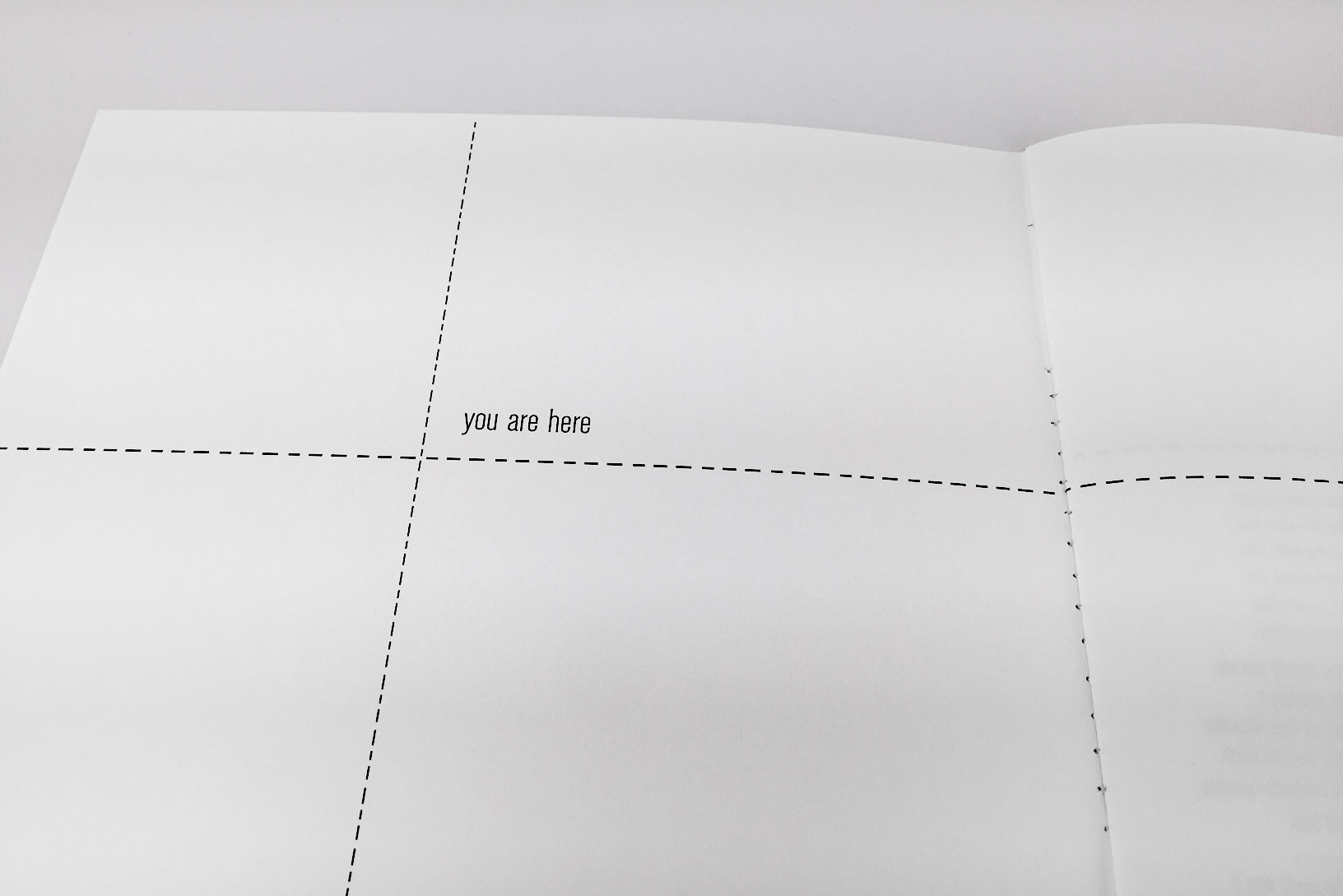
The booklet ends after the quote “It has often been said that astronomy is a humbling, character-building experience. There is no better technological demonstration of the folly of human conceits than the distant image of our tiny world. It underscores our responsibility to preserve and cherish this blue dot, the only home we have.” The last line ends back at the intersection, which is smaller and further in the corner. The type is all alone after that journey, much like the Voyager I. Growing more and more distant from the Earth.
