Hodgepodge
brand identity // print // illustration // packaging // publication
An assortment of small-scale student projects, personal projects, and more.
Board Game Packaging
This was a student project where we designed the packaging for a board game. I chose Rummikub, a game my grandmother and I enjoy.
Rummikub is based both on the traditional Indian rummy card game and the Chinese tile game Mahjong. I was inspired both by the decorative mahjong boxes and by Indian designs and patterns. I decided to design the box with deocrative patterns made with numbers.
Book Cover
This was a student project where we were tasked to illustrate and design a book cover for Einstein’s Riddles: Riddles, Paradoxes, & Conundrums to Stretch Your Mind.
My concept was to depict numerous references to the book’s content using an illustration style emulating the 1920s and 30s art deco style. The illustration accomplishes this through the dramatic geometricism, overlapping shapes, and use of gradients.
Illustrated Album Cover
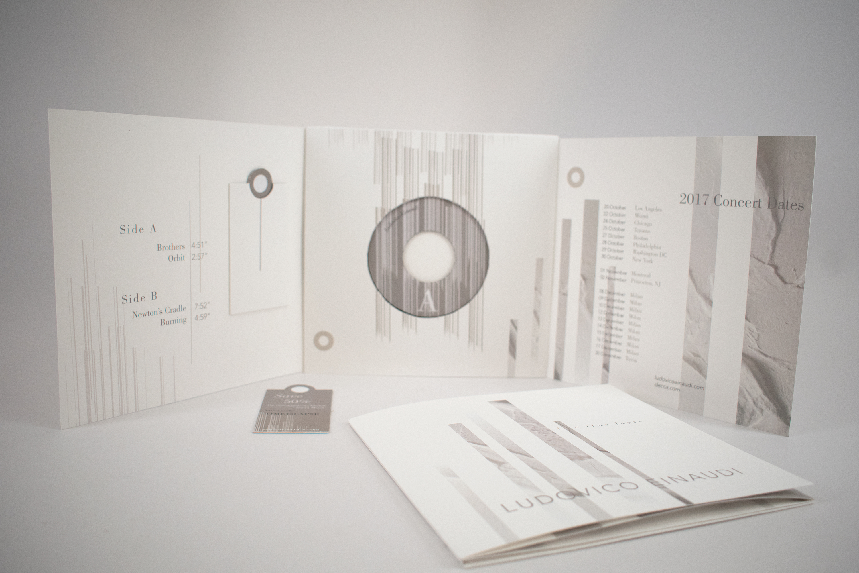
For an undergraduate project were tasked with designing a vinyl album cover of any artist of our choosing. I chose Ludovico Einaudi, an Italian contemporary piano composer, and one of my favorite artists. Ludovico’s style of composition has clear classical influences while being modern by utilizing minimalism and electronic qualities. This creates a dramatic, lyrical album.
My concept was to evoke this harmony between classical and modern by using negative space and a muted color palette but also feature geometric shapes with images of paint. The paint contributes an organic aspect to offset the harsh geometric shapes.
Feminism Poster
For an illustration class we were assigned to create an instructional “how-to” poster. At the time I was also taking an advertising class where we were learning about some of the outrageous ads from the 40s/50s (“outrageous” aka sexist).
I decided to use a similar illustration style as those 40s/50s ads, emulating pop art such as
the work of Roy Lichtenstein. However, I deliver a much different message.
Note: my advertising professor loved it.
Strength of the Mountain
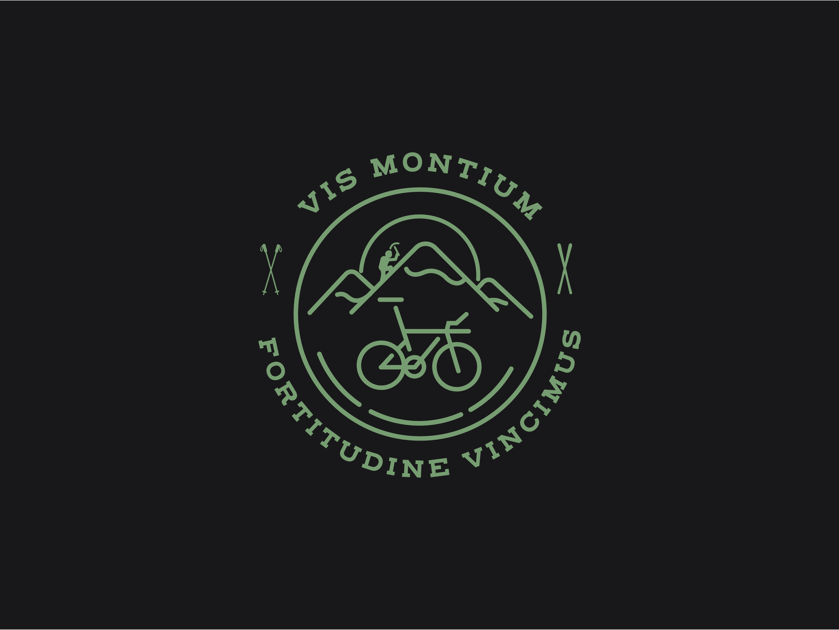
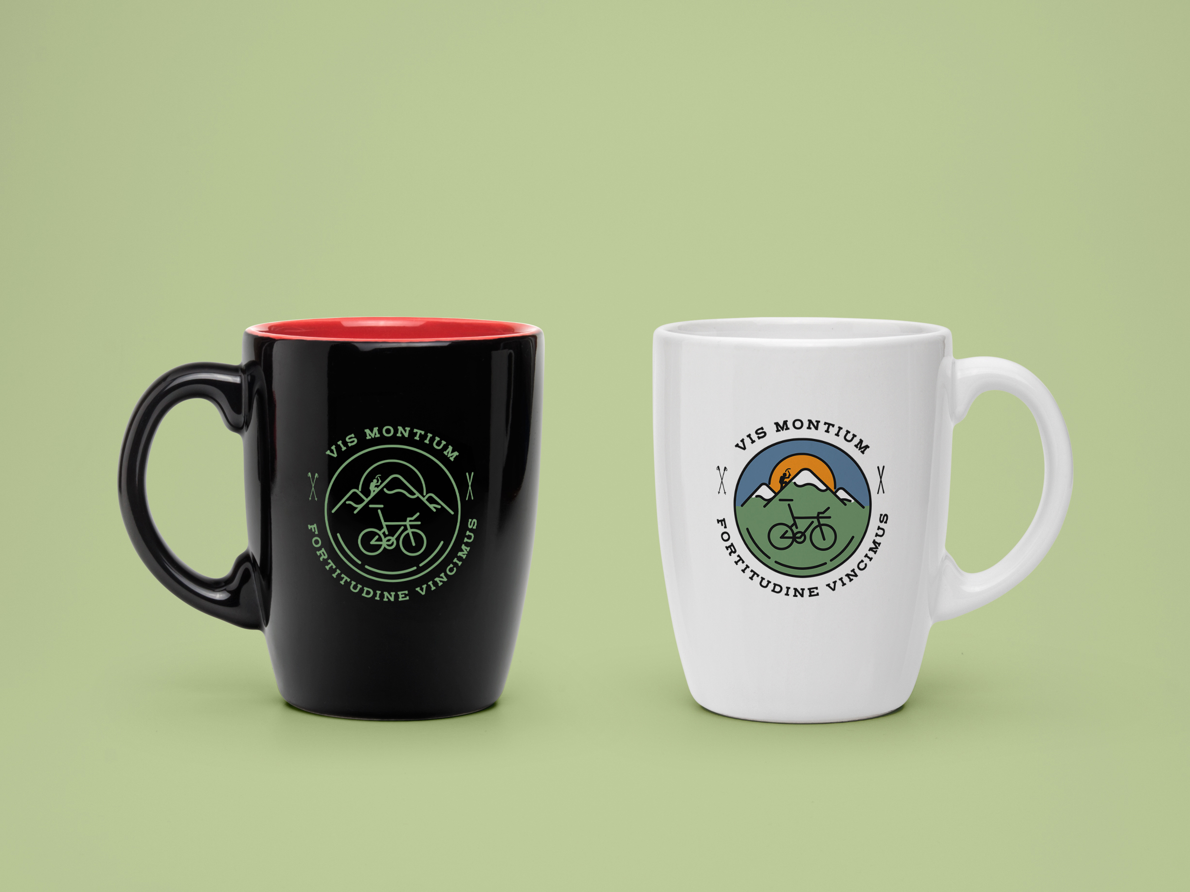
A close family member who is an avid triathlete, military history enthusiast, and an aspiring glacier climber commissioned this illustration. Vis montium means “Strenth of the Mountains” and was the motto of the United States Marine Corps’ 80th Division during WWI. Fortitudine vincimus means “through endurance we conquer.” It was the family motto of Ernest Shackleton, an Anglo-Irish Antarctic explorer who led three British expeditions to the Antarctic.
IBM Wild Ducks Cards
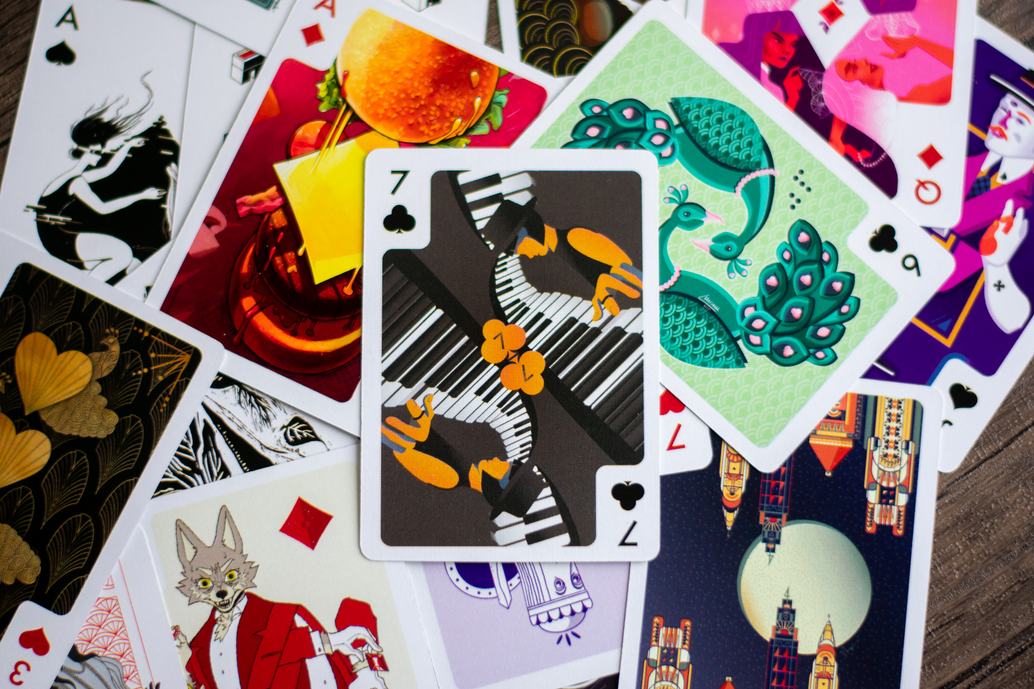
IBM Wild Ducks Playing Cards is a yearly global effort among IBM designers to create a deck of playing cards.
It was and still is organized by IBM designer Russell Huffman. Each deck consists of 55 cards contributed by 55 artists. In 2020, I was
lucky enough to be one of the 55 designers, and got to design the 7 of clubs. The theme for the 2020s deck was “The New Roaring 20s.” Arists were
encouraged to interpret that as freely as they liked.
I decided I wanted to reference the 1920s through music, but make it more modern through the illustrative style and the characterization of the piano player, who looks
like someone who'd be from the 2020s.


